Theme Styles
Theme Styles are site-level style defaults in Bricks. Use them to define the baseline look for pages, templates, and elements: typography, links, colors, contextual spacing, buttons, forms, images, layout elements, popups, and other element defaults.
Theme Styles are not a replacement for global classes or element styles. They are the broadest styling layer. More specific styles can override them.
Use Theme Styles for defaults that should apply to a context. Use global classes for reusable patterns. Use element ID styles for one-off exceptions.
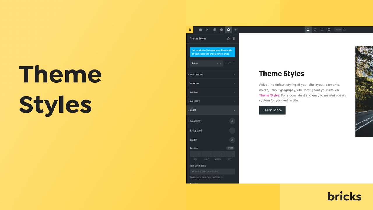
Access Theme Styles
Section titled “Access Theme Styles”Open the builder, click the Style Manager icon, and select Theme Styles.
To create a Theme Style:
- Open the Theme Styles selector.
- Type a name.
- Press
Enteror click the save icon. - Select the Theme Style.
- Add conditions.
- Configure the style groups.
The mental model
Section titled “The mental model”A Theme Style has two important parts:
- Conditions: where the Theme Style applies.
- Settings: which defaults it outputs.
On each frontend request, Bricks checks the Theme Style conditions against the current context. Matching Theme Styles become active. Bricks then generates CSS from the active Theme Style settings.
The builder also calculates the active Theme Style for the page you are editing, so the Theme Styles panel can show active styles separately from other styles.
Style hierarchy
Section titled “Style hierarchy”Theme Styles are baseline styles. They are output before more specific Bricks-managed CSS such as global classes, page settings, template content, element settings, and popup styles.
Practical result:
- Theme Style sets the default.
- Global class styles can override matching Theme Style defaults.
- Page settings can override matching Theme Style defaults.
- Element ID styles can override matching Theme Style defaults.
- Custom CSS with stronger selectors or later output can override Theme Styles.
Example:
- Theme Style sets all buttons to black text.
- A global class
.button--primarysets button text to white. - A specific button ID sets text to red.
The specific button ID wins for that button because it is more specific and output later.
Conditions
Section titled “Conditions”Open the Conditions control group to tell Bricks where on your site this Theme Style should be used.
To apply a Theme Style to your entire website, open Conditions, click Add Condition, and select Entire Website.
You can set as many Theme Style conditions as you want.
For example, to apply a Theme Style to two specific landing pages and your home page:
- Add a condition for the individual landing pages.
- Add another condition for Front page.
The Theme Style matches when any non-excluded condition matches the current context.
Exclude condition
Section titled “Exclude condition”Since Bricks 1.3.6 you can set exclude conditions for any Theme Style. To exclude a specific condition, toggle the exclude control. If the exclude condition applies, Bricks does not use that Theme Style for the current context.
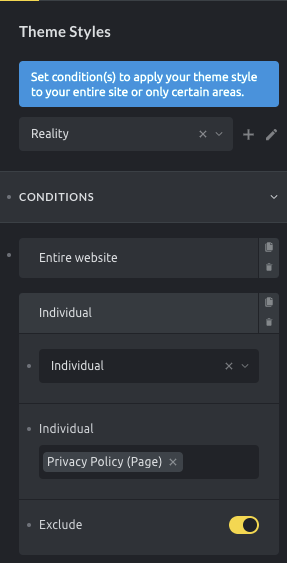
Use this Theme Style everywhere except for the Privacy Policy page
Active Theme Style resolution
Section titled “Active Theme Style resolution”When multiple Theme Styles match a page, Bricks scores the matching conditions by specificity.
Common specificity order:
- Entire Website: broadest match.
- Archive or generic archive conditions.
- Post type conditions.
- Specific archive, term, search, error, or child conditions.
- Front page.
- Specific post/page IDs: most specific common match.
The exact match can depend on the current request, preview context, archive type, taxonomy, post type, multilingual translation, and custom condition filters.
By default, Bricks loads only the most specific matching Theme Style.
For example:
- Theme Style A targets Entire Website.
- Theme Style B targets Pages.
- Theme Style C targets a specific page.
On that specific page, Theme Style C is the most specific match and is the one Bricks loads by default.
Loading Method
Section titled “Loading Method”Configure the Theme Styles loading method under WordPress Admin > Bricks > Settings > General > Theme Styles: Loading Method.
Options:
- Most specific: Default. Bricks loads only the most specific matching Theme Style.
- Load all matching theme styles: Bricks loads every Theme Style whose conditions match the current page.
Use Most specific when each context should have one complete Theme Style.
Use Load all matching theme styles when you intentionally stack Theme Styles, such as:
- A global typography Theme Style for the entire site.
- A blog Theme Style for posts.
- A landing-page Theme Style for a small set of pages.
When loading all matching Theme Styles, Bricks keeps the matching styles ordered by condition specificity. If multiple active Theme Styles set the same property, the normal CSS cascade decides the final result. Avoid accidental overlaps by keeping each Theme Style focused.
Style groups
Section titled “Style groups”The available groups depend on the active Bricks version, registered elements, and integrations. Core groups include:
- Conditions: where the Theme Style applies.
- Stylesheet: custom CSS for this Theme Style.
- General: broad site defaults.
- Colors: default color values.
- Links: link defaults and optional additional link selectors.
- Contextual spacing: spacing rules and default margin/padding cleanup.
- Content: content margin defaults.
- Typography: HTML and text defaults.
- Popup: popup defaults.
- Elements: defaults for supported elements such as Section, Container, Block, Div, Button, Heading, Image, List, Nav Menu, Post Content, Text, Video, and others.
Integrations can register additional Theme Style groups.
Stylesheet group
Section titled “Stylesheet group”The Stylesheet group lets you add custom CSS as part of a Theme Style.
This CSS is output with that Theme Style. It is not breakpoint-aware in the same way as generated control CSS, so use normal CSS and media queries when needed.
Use the Stylesheet group for CSS that belongs to the same Theme Style context. Use global custom CSS for site-wide code that should not depend on Theme Style conditions.
Typography notes
Section titled “Typography notes”Theme Styles can set typography defaults for HTML, body text, headings, links, and element-specific typography controls.
When multiple typography controls apply, Bricks orders the generated typography CSS so more specific heading settings can override broader heading settings.
If Style Manager scales are configured, the Style Manager can use the Theme Style HTML font size as the auto value for rem-based scale calculations unless Style Manager settings override it.
Pseudo classes
Section titled “Pseudo classes”Theme Styles can store pseudo-class settings, such as hover or focus states, for supported style groups.
Use pseudo-class settings for broad defaults. Use global classes when the state belongs to a reusable component pattern. Use element ID styles when the state is unique to one element.
Export
Section titled “Export”- Inside the builder, open Style Manager > Theme Styles.
- Select the Theme Style you want to export.
- Click the export icon.
- Download the generated JSON file.
Import
Section titled “Import”- Inside the builder, open Style Manager > Theme Styles.
- Click the import icon.
- Select the Theme Style JSON file.
- Upload it.
If a Theme Style with the same ID already exists in your installation, Bricks skips the import for that style. Rename or duplicate the source Theme Style before exporting if you need to import it as a separate style.
Page Settings and Theme Styles
Section titled “Page Settings and Theme Styles”Page Settings apply to the current page or template and are output after Theme Styles. Use Page Settings for page-specific settings such as one-page navigation, page-level code, SEO/social values, or page-specific styling.
If a style should become the default for a group of pages, use Theme Styles. If it should affect one page or template, use Page Settings.
Style Manager and Theme Styles
Section titled “Style Manager and Theme Styles”Theme Styles are one part of the Style Manager. They work alongside:
- Color Manager.
- Global Variables Manager.
- Global Class Manager.
- Style Manager settings and scales.
Theme Styles define broad defaults. Variables and color palettes provide reusable values. Global classes provide reusable patterns.
Best practices
Section titled “Best practices”- Always add conditions. A Theme Style without conditions will not become active.
- Start with an Entire Website Theme Style for baseline typography, links, and broad element defaults.
- Use more specific Theme Styles only when a context really needs different defaults.
- Avoid setting the same property in many stacked Theme Styles unless you understand the cascade.
- Keep component-specific styling in global classes when the style belongs to a reusable pattern.
- Use the Stylesheet group for context-specific CSS, not unrelated global CSS.
- Test specific pages, archives, templates, and multilingual versions after changing conditions.
Troubleshooting
Section titled “Troubleshooting”A Theme Style is not active
Section titled “A Theme Style is not active”Check whether it has at least one condition, whether an exclude condition applies, and whether another Theme Style is more specific under the Most specific loading method.
A broad Theme Style disappeared on a specific page
Section titled “A broad Theme Style disappeared on a specific page”That is expected in Most specific mode when a more specific Theme Style matches the page. Switch to Load all matching theme styles only if you want styles to stack.
A Theme Style control does not affect an element
Section titled “A Theme Style control does not affect an element”Check whether the element has a global class, element ID style, page setting, or custom CSS overriding the same property.
A group or control is missing
Section titled “A group or control is missing”Theme Style groups depend on registered elements and integrations. If an element or integration is unavailable, its Theme Style group may not be shown.
Custom CSS in the Stylesheet group is not responsive
Section titled “Custom CSS in the Stylesheet group is not responsive”The Stylesheet group is plain CSS. Add your own media queries if the CSS needs breakpoint-specific behavior.
Was this helpful?
A quick vote and short notes help us improve these docs faster.
Leave a note for us
Please do not include passwords, license keys, or personal data. We store submitted notes to improve the docs.
Thanks for sharing feedback. We're using it to improve these docs.